Important links
- To follow this tutorial you need to use Elementor PRO (Advanced or higher plans)
- Watch my full Elementor PRO tutorial if you want to create a whole Elementor website from scratch
- Access my free WordPress Community to get in touch!
Off-canvas mobile menu Elementor: complete tutorial
The standard Elementor mobile menu is very limited when we want to optimise it and make it truly responsive for tablet and mobile devices.
The most powerful solution if you want to have granular control on your Elementor mobile menu (without plugin) is to use the powerful popup builder included in Elementor PRO “Advanced” or higher plans.
Using the popup builder and linking it to a button in your mobile header, will give you all the freedom you need to create and advanced off-canvas mobile menu in Elementor that will look modern, easy to use and easy to manage.

Creating a beautiful off-canvas menu with Elementor Pro
In this tutorial, I will guide you through the process of creating a stunning Elementor slide out menu for tablet and mobile devices using the popup feature included in Elementor Pro. By following these steps, you will be able to overcome the limitations of the standard Elementor menu when it comes to optimizing for responsive mobile and tablet viewing.
Introduction
Greetings, WordPress enthusiasts! I'm Pascal, the creator of WP Roads YouTube channel and website, where I share my love for all things WordPress, including tutorials, news, and reviews. If you're keen on WordPress-related content, make sure to subscribe to my YouTube channel and newsletter at wproads.com.
Setting Up the Off-canvas Menu
To begin creating your Elementor off-canvas menu, we will utilize the Elementor popup builder. Start by navigating to the ‘Templates' section in Elementor and select ‘Popups.' Click on ‘Add New Template' and choose ‘Popup' as the template type. Give your popup a name, such as ‘Mobile Menu,' and proceed to create the template.

Designing the Popup Layout
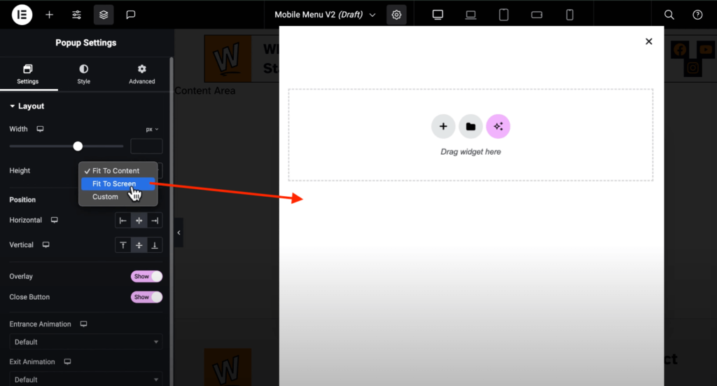
Within the popup settings, you have the flexibility to customize various aspects of the menu. You can adjust the background color, width, height, position, entrance and exit animations, and more to tailor the menu to your preferences. Ensure essential elements like the close button are included for user convenience.

Here you will have to setup the vertical height of the popup to “Fit To Screen” in order to make the popup become ready for a perfect a full with off canvas mobile menu.
Styling the Menu
In the style tab of the popup settings, you can further enhance the menu's appearance by selecting background colors, overlay settings, adjusting border radius, and styling the close button.
The advanced tab
In the advanced tab you have some cool features, I would suggest you to enable just two of them:
- Disable page scrolling: to prevent the scrolling on the page when the slide out menu is open
- Enable Accessible Navigation: to increase your website accessibility and make people be able to easily navigate the content of the popup menu from their keyboard.
Adding Content
Next, populate the off-canvas menu with content such as a logo, heading, navigation items, and social media icons. Customize the appearance of each element to ensure a cohesive and visually appealing design that aligns with your website's branding.

Finalizing the Menu Installation
Once you've designed and styled the slide out menu, you can proceed to integrate it into your header. Utilize a button or icon linked to the newly created mobile menu, and hide it from desktop view ensuring it is visible only on mobile devices.
To link your Elementor popup menu to a button or an icon on your Elementor header you just need to open the button settings, go to the link input click on the gear icon and scroll down until you find “popup”, you'll be able then to select the popup menu that you have just created.

Test the functionality, adjust settings if needed, and voilà! You now have a beautiful Elementor off-canvas menu built with the powerful popup builder of Elementor PRO!
Conclusion
By following this tutorial, you can elevate the mobile and tablet viewing experience on your Elementor WordPress website by implementing a sleek and functional slide-in menu using Elementor Pro's popup feature. Enhance navigation, improve accessibility, and create a visually engaging menu tailored to your website's design aesthetics.
Thank you for exploring this tutorial on creating a beautiful slide out menu with Elementor Pro. For more WordPress tips and tricks, stay tuned to WP Roads, and feel free to share your feedback in the comments below. Happy designing!
PSST!
If you want to learn how to create an awesome Elementor PRO website from scratch: just check my free ultimate Elementor tutorial here! (Already more than 13k views on YouTube!)

")