How to Customize the WooCommerce Checkout Page in Elementor Pro (Step-by-Step)
This tutorial is sponsored by Cloudways, one of the best WordPress hosting, perfect for e-commerce and high traffic websites 🚀
Designing a high-converting checkout page is one of the smartest moves you can make for any WooCommerce store. In this tutorial, we’ll rebuild the WooCommerce checkout page from scratch using Elementor Pro, transforming the default layout into a clean, focused, and professional experience that keeps your customers from abandoning their carts.
Whether you’re a freelancer building stores for clients or managing your own e-commerce brand, this guide will help you master Elementor WooCommerce Checkout customization — fully optimized for performance, security, and conversions.
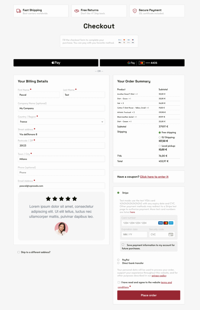
The result we are going to achieve by following the video tutorial at the top of this post ✅ 👇
Why Checkout Optimization Matters
Most store owners focus on fancy product pages and forget the one step that actually brings revenue: the checkout. A slow or confusing checkout layout directly affects your conversion rate. Before you start designing, make sure your foundation — hosting — is fast and reliable.
I would recommend a hosting like Cloudways for WooCommerce sites. It’s managed cloud hosting built for performance and scalability. You can choose providers like DigitalOcean, AWS, or Google Cloud, all managed through a clean dashboard with free CDN, daily backups, and autoscaling.
If your store lags during high-traffic events like Black Friday, switching to Cloudways might be the upgrade you need.
Getting Started: Elementor Pro and WooCommerce
To follow along, you’ll need:
- WooCommerce installed and configured
- Elementor Pro (the Advanced or higher plan, which includes the Checkout widget)
If you don’t already have Elementor Pro, grab it here. Once activated, create a new page and name it something like “New Checkout” or “Checkout v2.” You can later assign it as your store’s checkout page under WooCommerce → Settings → Advanced (or Elementor → Site Settings → WooCommerce).
Switch the layout to Elementor Canvas — this removes the header and footer so customers stay focused entirely on completing their purchase.
Designing the Checkout Header Section
Start with a flexbox container or grid above your checkout form. This top section will include:
- Your checkout title
- Trust badges like “Secure Payment” or “Fast Shipping”
- A small “Back to Cart” link for better navigation
Use consistent padding (e.g., 2rem top and bottom) and global colors. Elementor’s global design system lets you manage all colors, fonts, and radiuses centrally — if you haven’t set this up yet, check my full Elementor Design System tutorial.
Customizing the WooCommerce Checkout Widget
Drag in the WooCommerce Checkout widget. By default, it looks cluttered and generic — here’s how to make it elegant:
Layout
- Use two columns for desktop and tablet, one for mobile.
- Keep the order summary sticky on desktop for better UX.
- Remove unnecessary sections and fields (eg: order details, address line 2, etc.).
Styling
- Use soft background colors to highlight key areas.
- Assign global border radiuses for visual consistency.
- Use Elementor’s typography controls to differentiate titles, descriptions, and labels.
Form Fields
- Simplify the form by hiding optional fields like “Company Name” or “Address Line 2.”
- Adjust spacing, padding, and font sizes to make forms easy to scan and fill out.
Reordering and Styling Checkout Fields (with Code)
Elementor’s checkout widget doesn’t let you reorder fields — but with a simple PHP snippet, you can.
Using a plugin like WPCodeBox or Fluent Snippets, paste a small custom snippet (available in the free WP Roads resource library) to:
- Reorder fields (e.g., move “Email” and “Phone” to the top)
- Define width:
100,50L, or50R - Hide unnecessary fields
This makes your checkout layout flexible and truly Elementor-safe, even after theme updates.
You can find the ready-to-use snippet at wproads.com/elecheckout.
Improving the Card Payment Section (Stripe)
Stripe’s default checkout boxes often look inconsistent. With a single line of CSS (available in my free resources page), you can transform the payment section into a minimal, modern card input that aligns perfectly with your new design.
You’ll find all the styling snippets for the payment section, dropdowns, and checkout fields on wproads.com/elecheckout.
Enhancing the Dropdown Styling
To modernize the country and state dropdowns, you can also use a simple CSS optimization available on the same resources page. This will create a polished look that matches the rest of your checkout UI — without any custom JS or extra plugins.
Adding Reviews or Trust Badges After Billing Details
Want to display customer reviews or trust badges below the billing form?
Create an Elementor template (e.g., “Checkout Trust Section”) and insert it dynamically with a short PHP snippet from my resources.
Example use cases:
- Display a 5-star review from a happy customer
- Show “SSL Secured Checkout” or “Money-Back Guarantee” icons
- Include accepted payment method logos
This technique is powerful for building trust right where it matters most — next to the payment button.
Mobile Optimization Tips
On mobile, keep it light and fast:
- Reduce padding and spacing
- Stack all elements vertically
- Hide secondary visuals if they push the checkout too far down
- Make sure your “Pay Now” button is always visible without excessive scrolling
Final Touch: “Back to Cart” Button
Always give users an easy way to return to their cart. Add a small text-style button linking to /cart/, positioned top-left.
It reduces frustration for users who realize they need to adjust something before checkout.
Conclusion
By combining Elementor Pro’s visual power with a few smart code snippets, you can transform a dull WooCommerce checkout into a high-performing, conversion-optimized experience.
From trust badges to simplified fields, every detail matters — and Elementor makes it all possible without custom templates or theme conflicts.
For more tutorials like this, check out:
- Complete WooCommerce + Elementor Pro E-commerce Tutorial
- Elementor Design System Guide
- Custom WordPress Dashboard For Clients